Color code

meaning of color

warm tones

Yellow is often considered the brightest and most energizing of the warm colors. It’s associated with happiness and sunshine. Light yellows also give a more calm feeling of happiness than bright yellows. Dark yellows and gold–hued yellows can sometimes look antique and be used in designs where a sense of permanence is desired.

Orange is a very vibrant and energetic color. In its muted forms it can be associated with the earth and with autumn.Because orange is associated with the fruit of the same name, it can be associated with health and vitality. In designs, orange commands attention without being as overpowering as red. It’s often considered more friendly and inviting, and less in–your–face.

Red is a very hot color. It’s associated with fire, violence, and warfare. It’s also associated with love and passion.It can have an overwhelming effect if it’s used too much in designs, especially in its purest form. It’s a great color to use when power or passion want to be portrayed in the design. With brighter versions being more energetic and darker shades being more powerful and elegant.

In design, brown is commonly used as a background color. It’s also seen in wood textures and sometimes in stone textures. It helps bring a feeling of warmth and wholesomeness to designs. It’s sometimes used in its darkest forms as a replacement for black, either in backgrounds or typography.

color theory

cold tones

Blue is often associated with sadness in the English language. Blue is also used extensively to represent calmness and responsibility. Light blues can be refreshing and friendly. Dark blues are more strong and reliable. Blue is also associated with peace and has spiritual and religious connotations in many cultures and traditions.

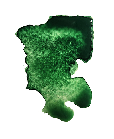
Green can have a balancing and harmonizing effect, and is very stable. It’s appropriate for designs related to wealth, stability, renewal, and nature. Brighter greens are more energizing and vibrant, while olive greens are more representative of the natural world. Dark greens are the most stable and representative of affluence.

The color of spirituality and imagination. Dark purples are traditionally associated with wealth and royalty, while lighter purples (like lavender) are considered more romantic. In design, dark purples can give a sense wealth and luxury. Light purples are softer and are associated with spring and romance.
The color of love and compassion. Pink is kind and comforting, full of sympathy and compassion, and makes us feel accepted. Its friendly, playful spirit calms and nurtures us, bringing joy and warmth into our lives. Pink is also a feminine and intuitive color that is bursting with pure romance.

black&white

complementary colors